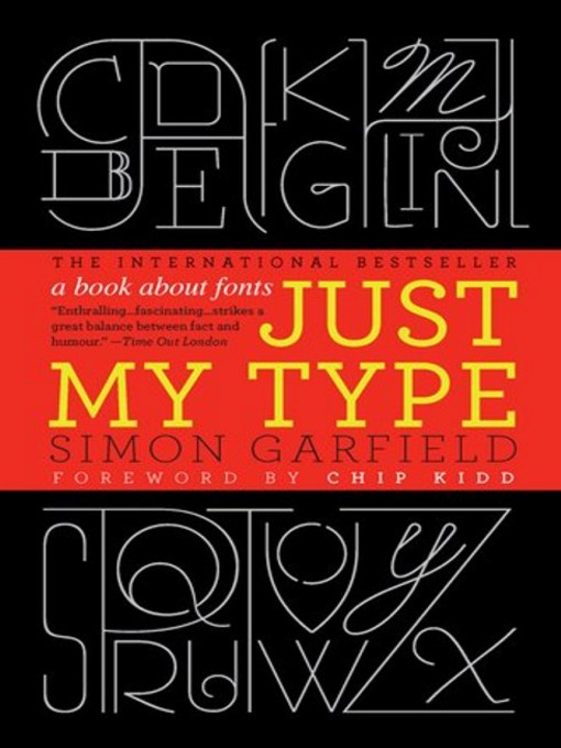
Typefaces are now 560 years old, but we barely knew their names until about twenty years ago when the pull-down font menus on our first computers made us all the gods of type. Beginning in the early days of Gutenberg and ending with the most adventurous digital fonts, Simon Garfield explores the rich history and subtle powers of type. He goes on to investigate a range of modern mysteries, including how Helvetica took over the world, what inspires the seeming ubiquitous use of Trajan on bad movie posters, and exactly why the all-type cover of Men are from Mars, Women are from Venus was so effective. It also examines why the "T" in the Beatles logo is longer than the other letters and how Gotham helped Barack Obama into the White House. A must-have book for the design conscious, Just My Type's cheeky irreverence will also charm everyone who loved Eats, Shoots & Leaves and Schott's Original Miscellany.
-
Creators
-
Publisher
-
Release date
September 30, 2011 -
Formats
-
OverDrive Listen audiobook
- ISBN: 9781452624518
- File size: 221190 KB
- Duration: 07:40:48
-
-
Languages
- English
-
Reviews
-
Publisher's Weekly
May 23, 2011
Printed type is no mere neutral conveyor of ideas but an artistic medium in its own right, with psychological, social, and even sexual overtones, according to this lively romp through the history of fonts. Garfield (The End of Innocence) surveys fonts from Gutenberg's dour Gothic and the elegant classicism of Garamond to the childlike faux-naïveté of Comic Sans, now so widely used for everything from medical brochures to tombstones that a movement has arisen to ban it. Along the way he revisits the sometimes lurid lives of the great typographersâincest and bestiality includedâand explores the legibility of highway signs and the subliminal messaging of presidential campaign fonts. There's much pop psychology hereâheavy, angular fonts seem male, apparently, while thin, curlicued ones are femaleâand a lot of engaging connoisseurship that occasionally goes overboard, especially when comparing look-alike modern sans serif fonts: you have to strain at gnats to distinguish the ubiquitous corporate cordiality of Helvetica from the "slightly softer and more rounded tone" of Arial. Regardless, Garfield's evocative proseâCooper Black is "the sort of font the oils in a lava lamp would form if smashed to the floor"âentices us to see letters instead of just reading them. Photos.
-
Loading
Why is availability limited?
×Availability can change throughout the month based on the library's budget. You can still place a hold on the title, and your hold will be automatically filled as soon as the title is available again.
The Kindle Book format for this title is not supported on:
×Read-along ebook
×The OverDrive Read format of this ebook has professional narration that plays while you read in your browser. Learn more here.